The tension
Push too hard, you break trust. Push too soft, nobody adopts.
The existing experience was built around providers users already knew and trusted. We needed to introduce Mercado Pago as a new option while preserving those familiar ways of receiving money.
The challenge was to drive adoption without disrupting familiarity and trust.
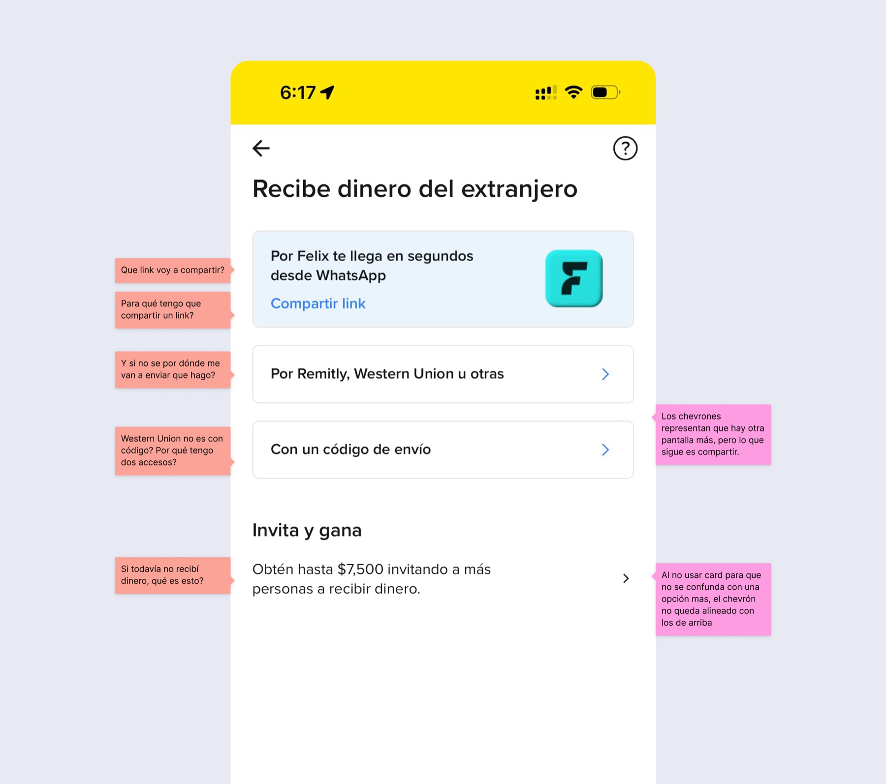 Before
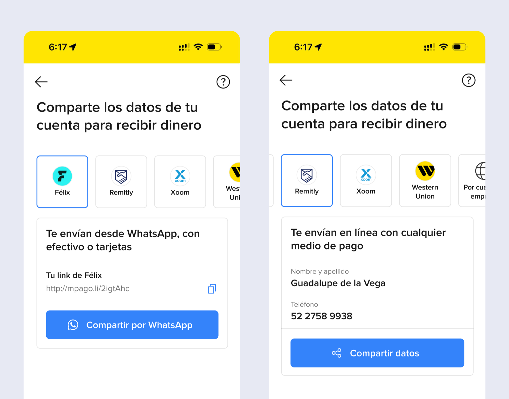 Before
In remittances, familiarity often matters more than efficiency.
Exploration
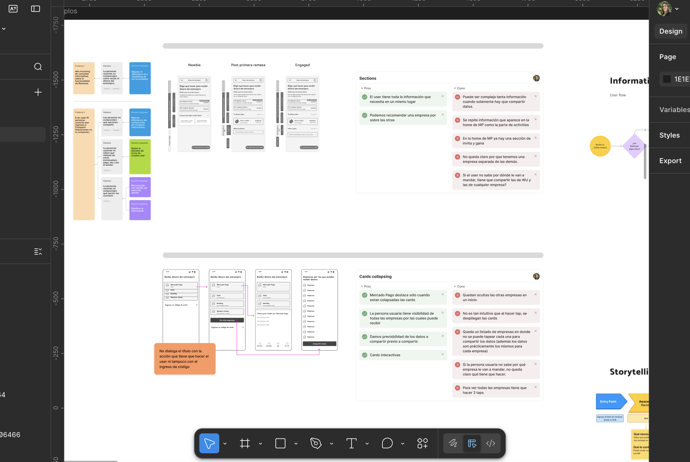
Pressure-testing the product strategy.
I explored different ways to prioritize Mercado Pago, organize providers and simplify the main entry points before moving into higher-fidelity concepts.
Pushing the experience further.
I developed a more expressive version with richer motion and interactions, then used it as the concept for a quick guerrilla usability test.
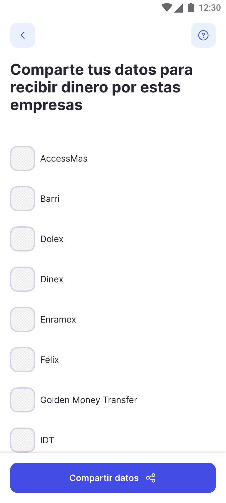
What we learned
A quick guerrilla test with 4 users gave us a fresh perspective.
Collapsed cards hid the other providers. Some users didn't realize they could expand them to see more options.
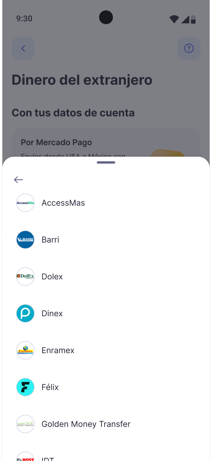
Replaced them with an explicit “Other providers” entry point leading to the full list.
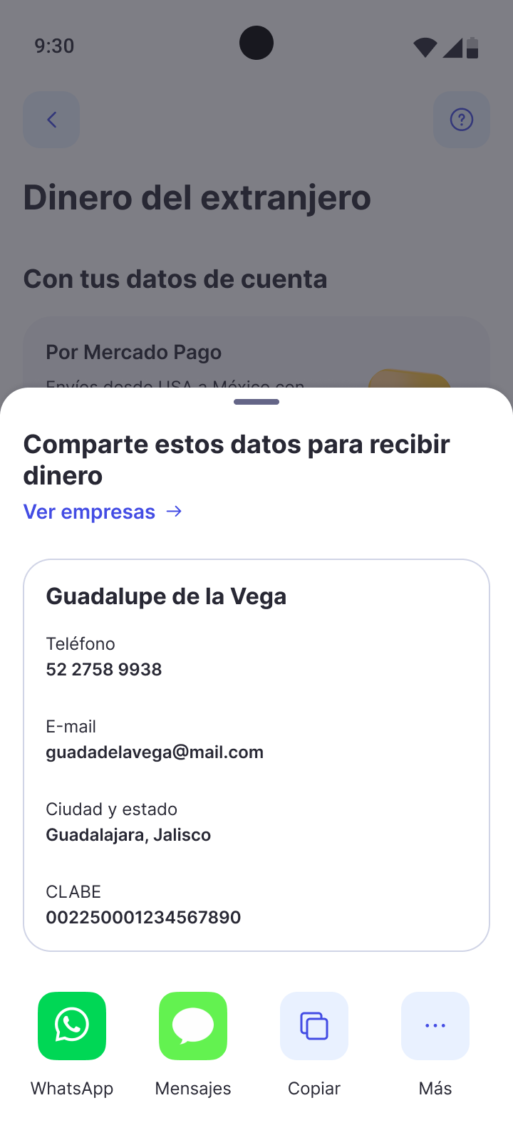
Sharing opened the phone's native share sheet before users could see the personal data they were about to send.
Added a step that shows the exact data before choosing how to share it.
Visual elements in the onboarding felt distracting or got in the way of the task.
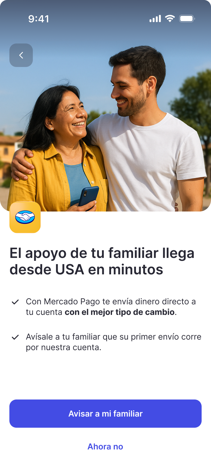
Keep the first-time experience focused on understanding and action.
Based on what we learned, I iterated on the onboarding, provider hierarchy and sharing interactions before moving to the final solution.
How the strategy played out
From strategy to product.
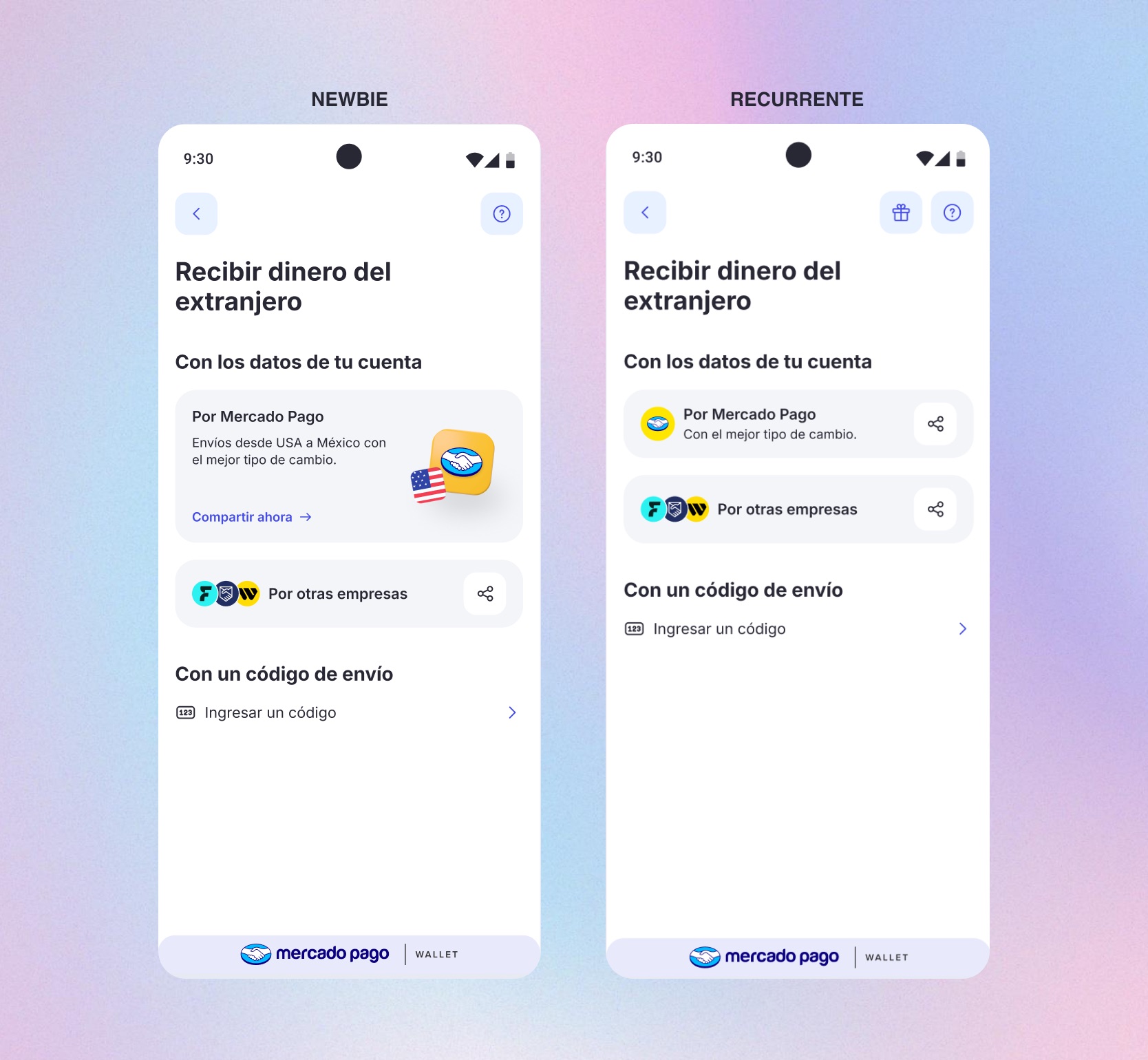
The hub
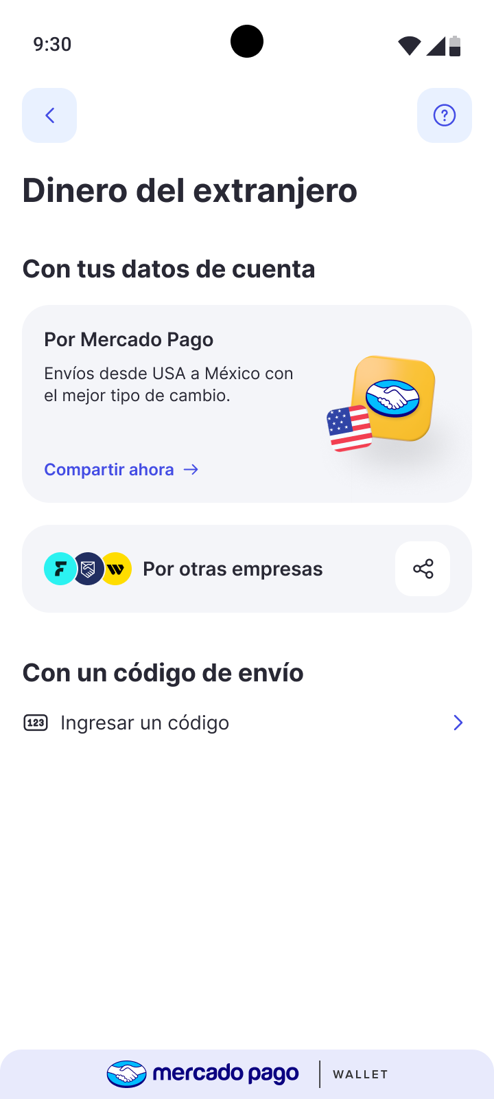
A hub that adapts to user maturity.
For new users, Mercado Pago is more prominent and explains its value while keeping other providers accessible.
After the first successful remittance, the experience becomes more compact and shifts the focus from education to faster access.
Trust in context
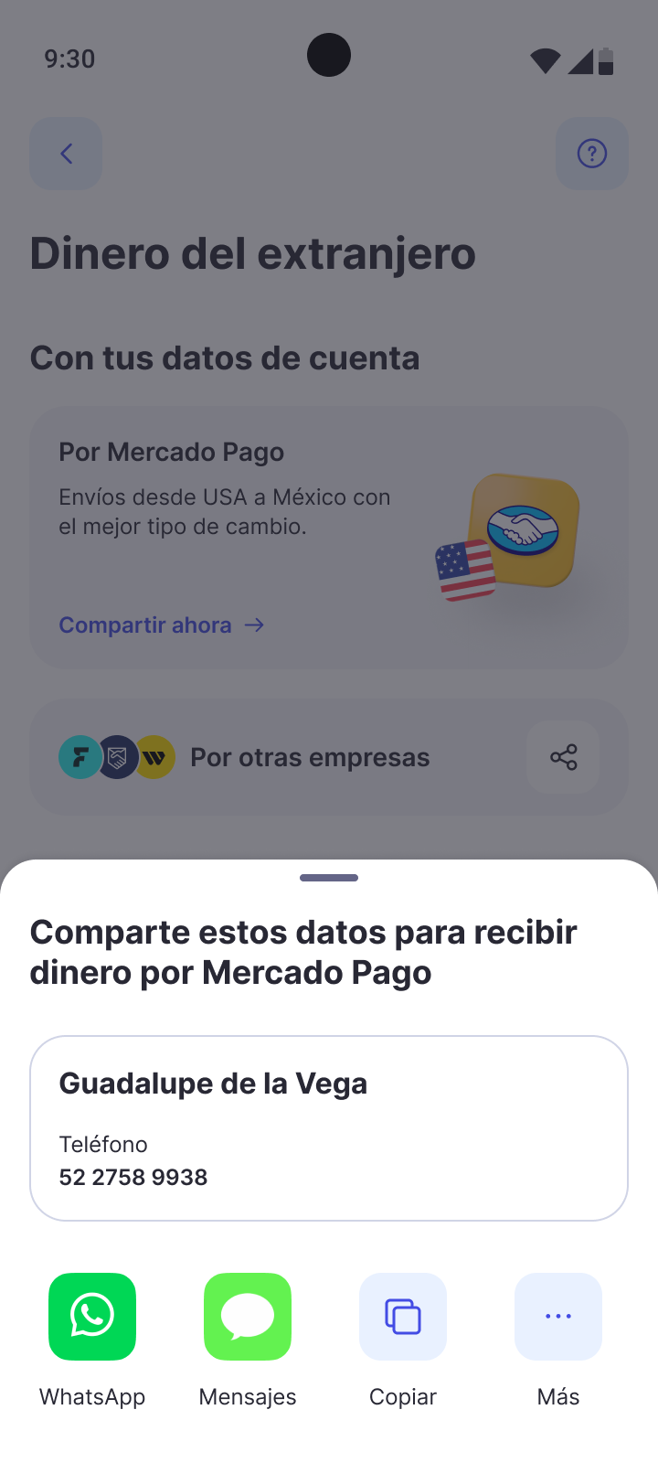
Trust at the riskiest step: sharing data.
Testing showed that users were unsure about what personal information they were about to share.
I redesigned the sharing interaction to show the exact data before the user chooses how to send it.
After launch: +46% users sharing account data/day.
Critical entry points
A clearer code entry experience.
Many users entered through a code provided by the sender, and nearly half of those codes failed validation, often because users didn't know which providers were supported.
We simplified the copy, surfaced the supported provider logos and added inline validation for 8- and 10-character codes. The number of failed entries dropped sharply.
How the sharing experience comes together.
The architecture in full
A hub-based flow, unified across providers.
The flow below shows the main path from entry to successful remittance. Edge cases and failure states were documented separately.
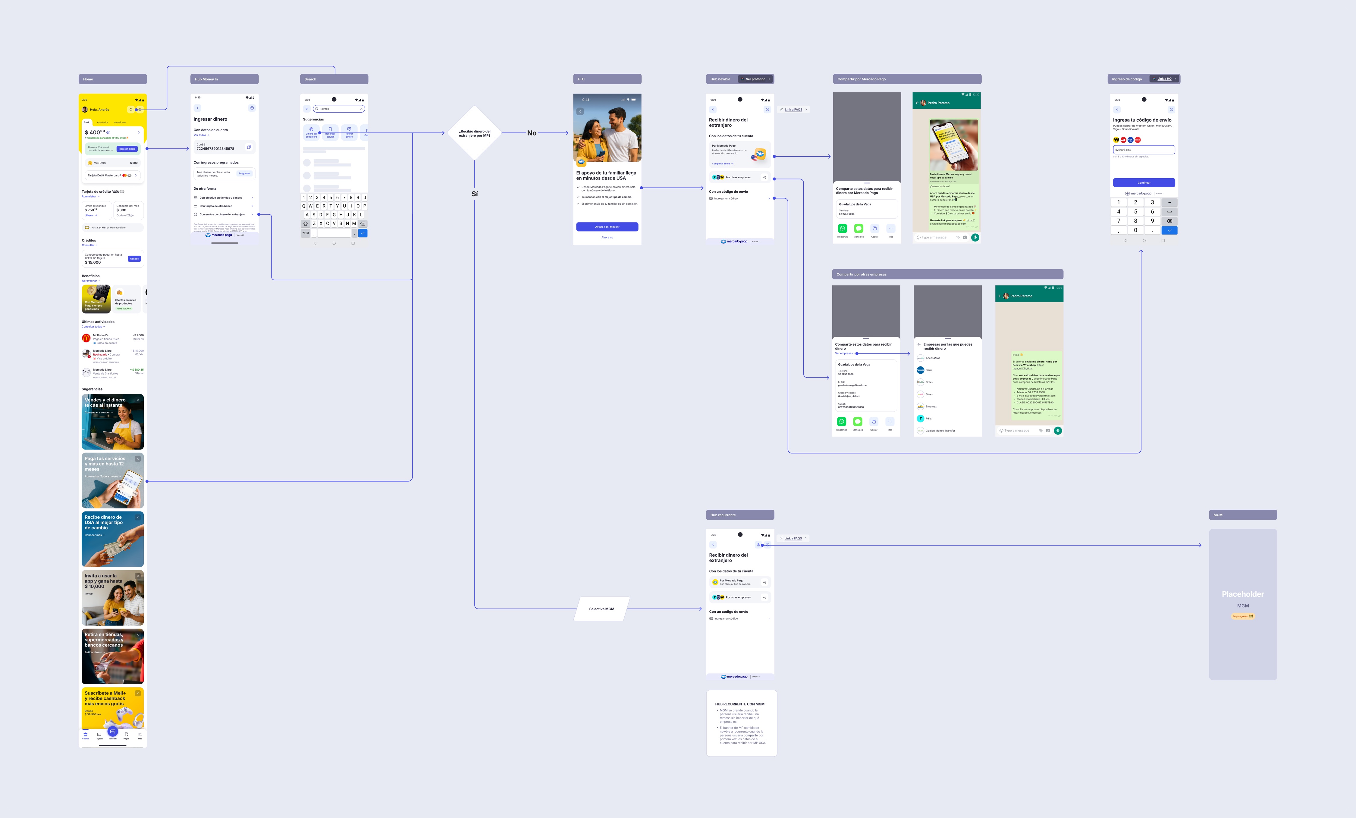 User flow — Tap to zoom · drag to explore
Designing for delivery
Beyond the happy path.
I documented the complete experience for IT, including flows, states, edge cases and implementation details. A few examples from the handoff are shown below.
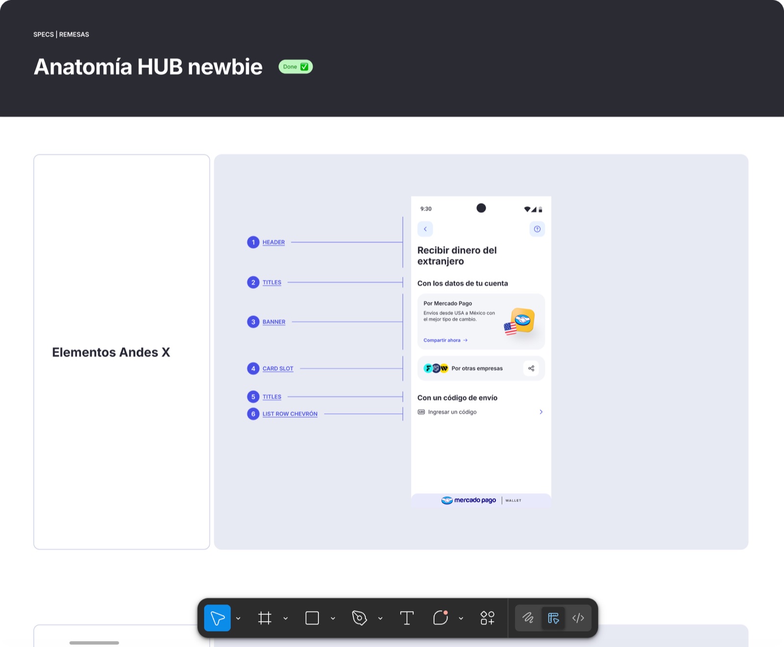
Component anatomy
Structure, spacing and behavior documented for consistent implementation.
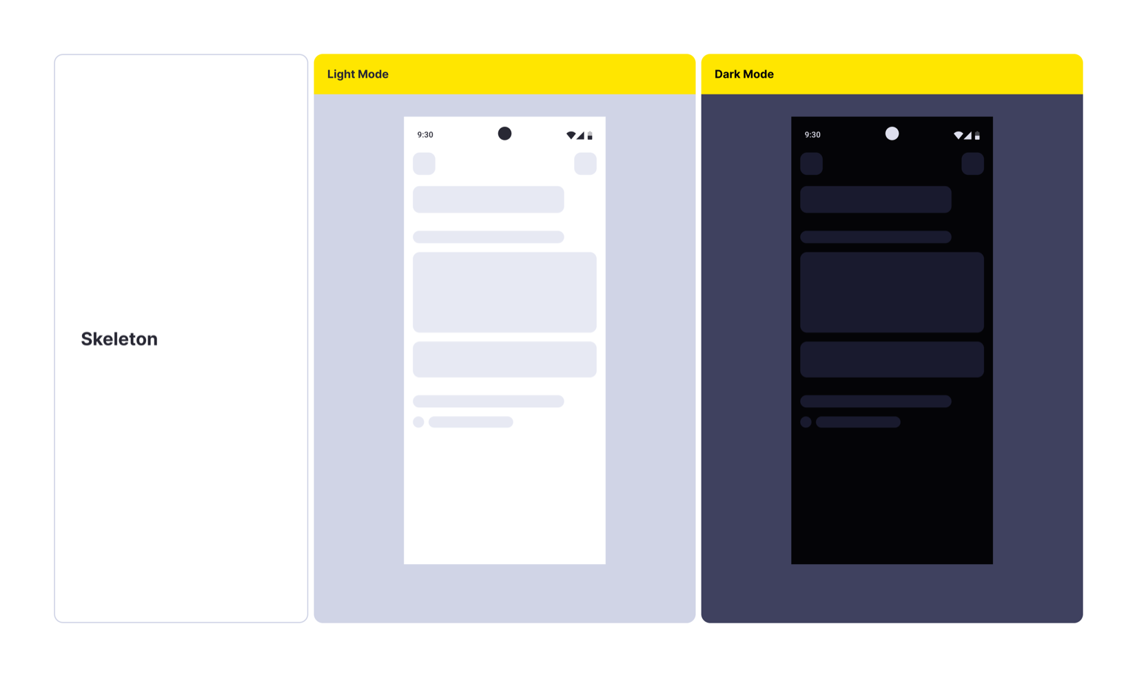
Loading across states
Skeleton states designed for new and returning users, across light and dark themes.
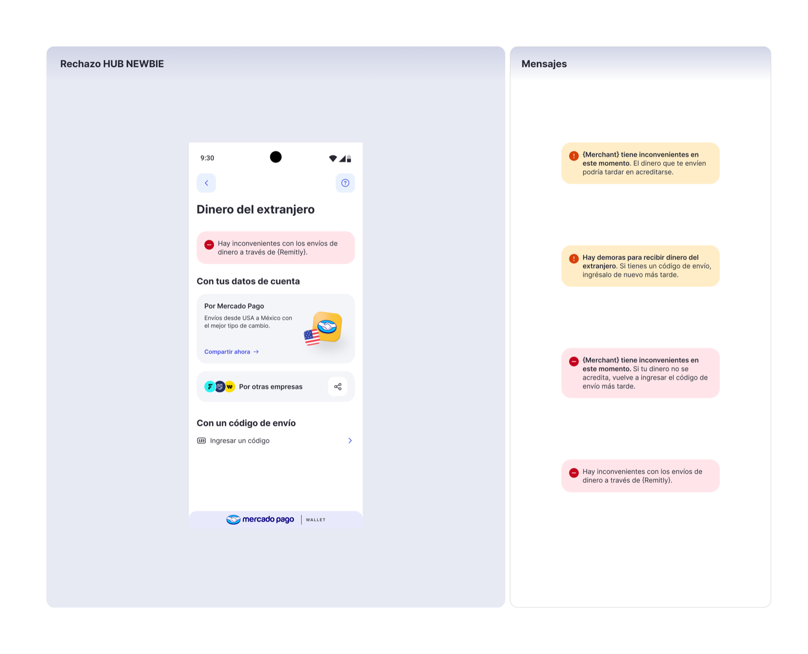
Failure states
Error scenarios documented across new and returning-user experiences, including recovery and provider-specific cases.
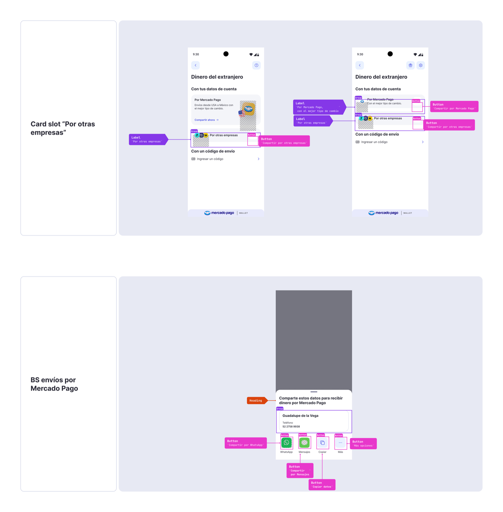
Accessibility by construction
With accessibility built into the Design System, I documented the specific roles and interaction behaviors required by this sharing flow.
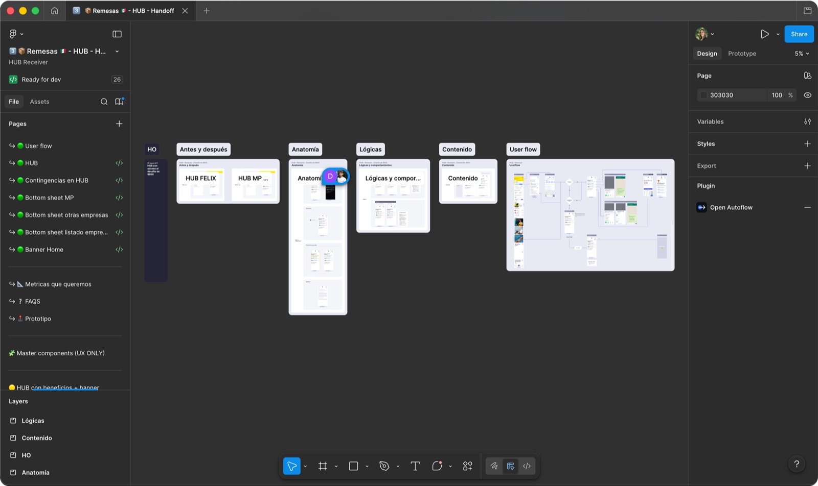 Complete developer handoff
Flows, states, specifications and implementation documentation.
Impact
Growth without eroding trust.
Less is more, but sometimes you need a little more to earn trust first. The system showed that a new product can gain traction without displacing what users already rely on.