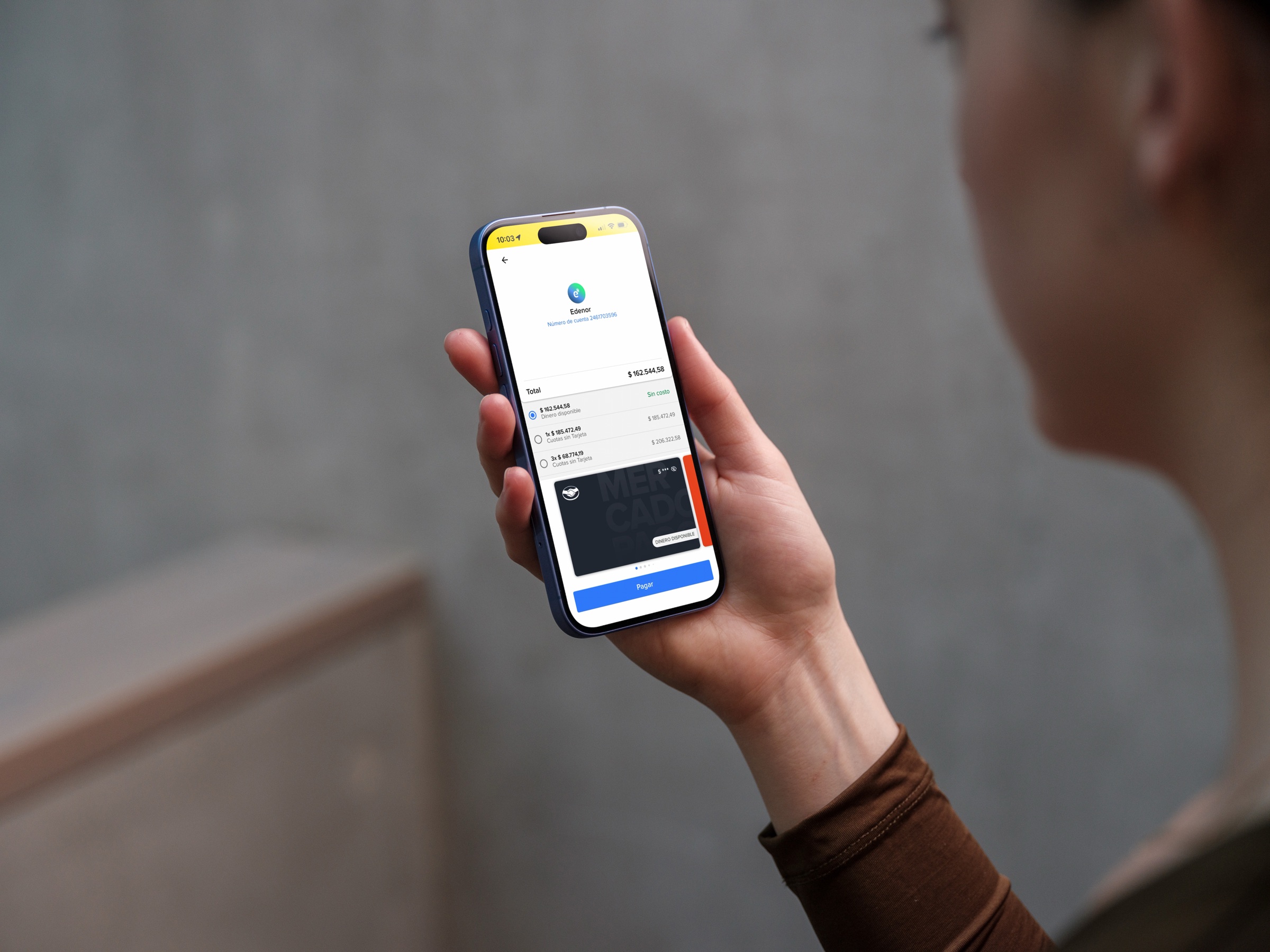
The starting point
The artwork was given. The experience wasn't.
New banking requirements introduced real card artwork into checkout. Provided by financial institutions, these assets came with colors and compositions we couldn't control. We needed to integrate them into the existing payment carousel while keeping every saved card identifiable, readable and consistent.
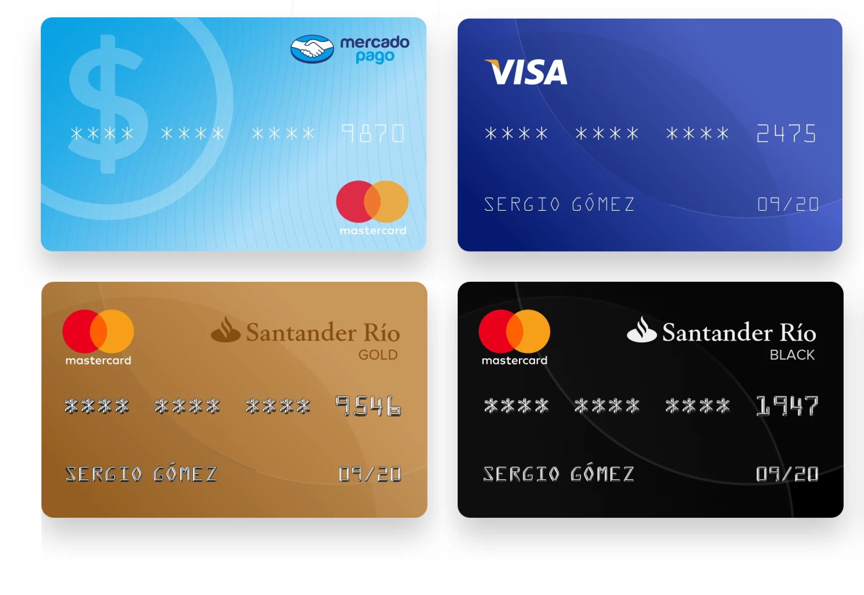 Before — generic card representations
Analysis
Finding consistency across different bank designs.
I analyzed the artwork to understand where issuer, network and card type information typically appeared, and where Mercado Pago could add a consistent identifier without competing with the information already present on the card.

- Issuer
- Card type
- Network
- Last four digits
Design decision
A consistent information layer across payment methods.
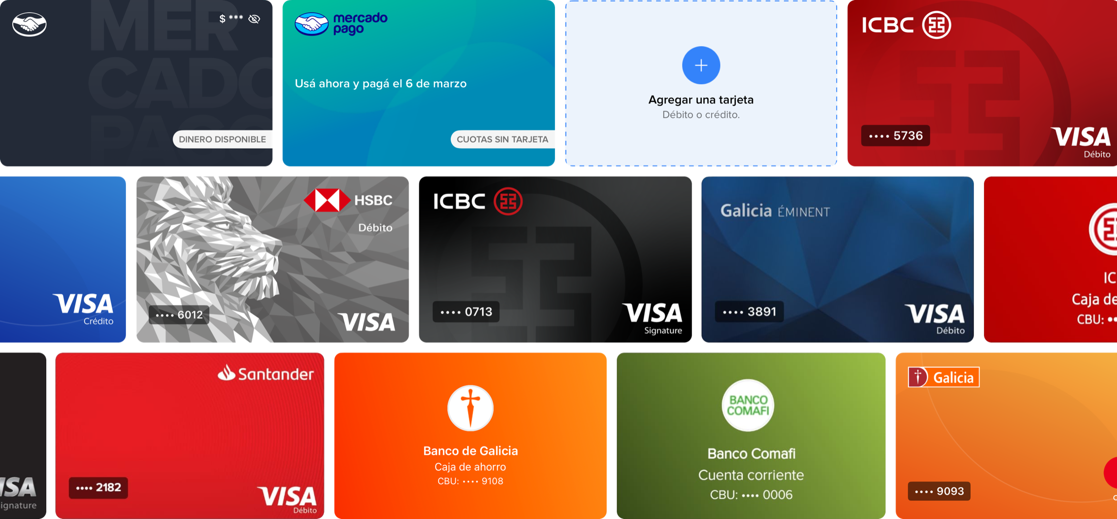
The last four digits became the common identifier for saved cards. I placed them consistently in the same area of every card, creating a predictable point users could scan regardless of the original artwork. A translucent dark container with white type kept the identifier readable across light, dark and complex backgrounds.
-
Light

-
Dark
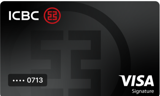
-
Complex
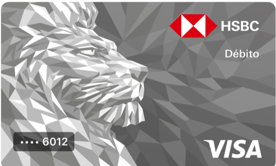
For Mercado Pago’s own payment methods, the card-type area was used to communicate what each option represented: Dinero disponible for Account Money and Cuotas sin tarjeta for Mercado Crédito.
- Bank card•••• 5736
- Account MoneyDinero disponible
- Mercado CréditoCuotas sin tarjeta

Payment methods
Adding a new payment method
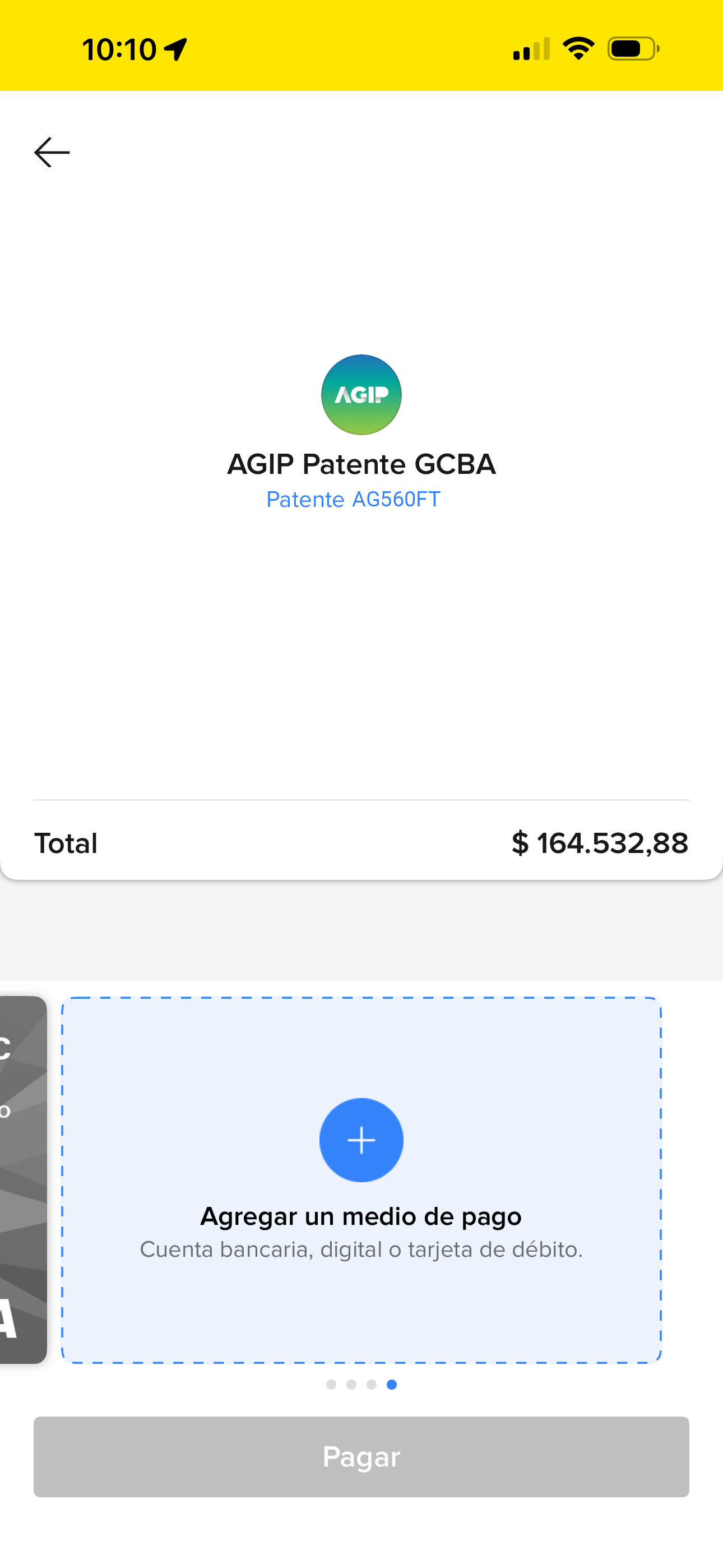
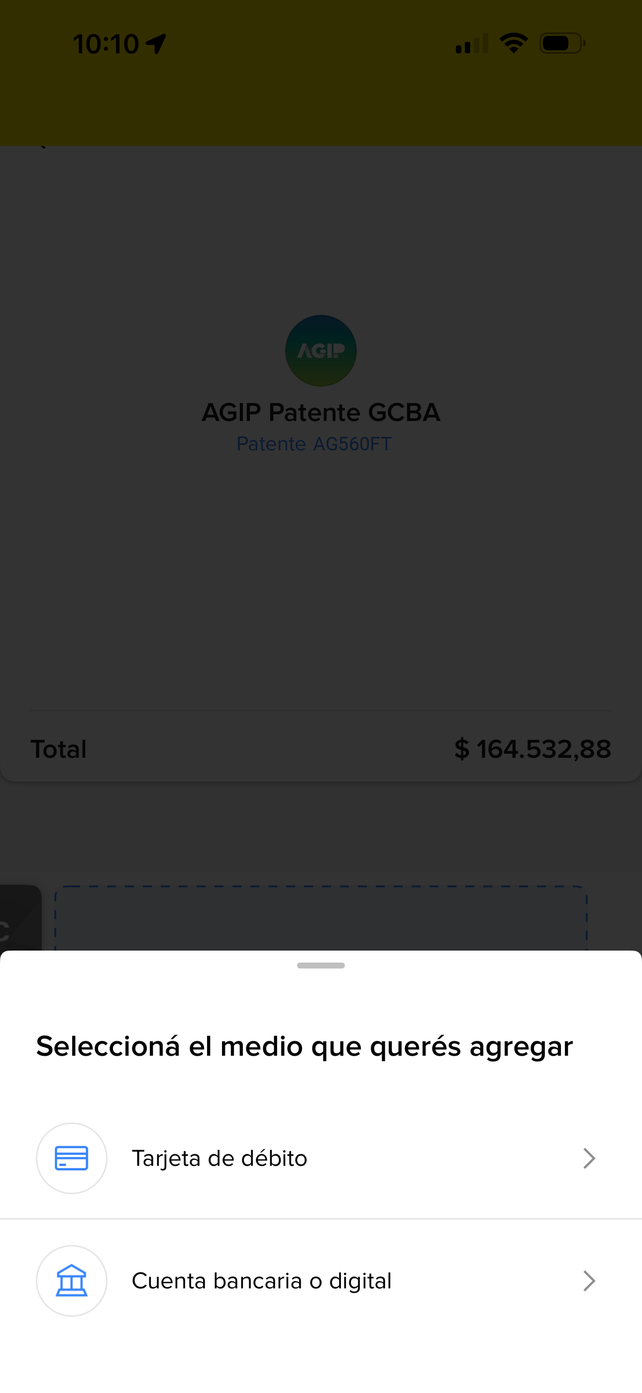
I also designed how users could add a new payment method directly from the carousel. Unlike available payment methods, this card needed to communicate an action rather than a selection.
A dotted outline and the Design System's interactive blue distinguish it from saved cards. Tapping it opens the flow to add a new payment method, while the checkout CTA remains disabled until a valid payment method is selected.
Payment hierarchy
Prioritizing our payment methods created new problems.
To increase adoption of Mercado Pago's own payment methods, Account Money and Mercado Crédito were moved to the front of the carousel. The change increased Mercado Crédito conversion, but it also surfaced two problems.
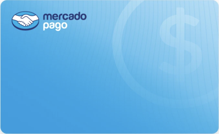
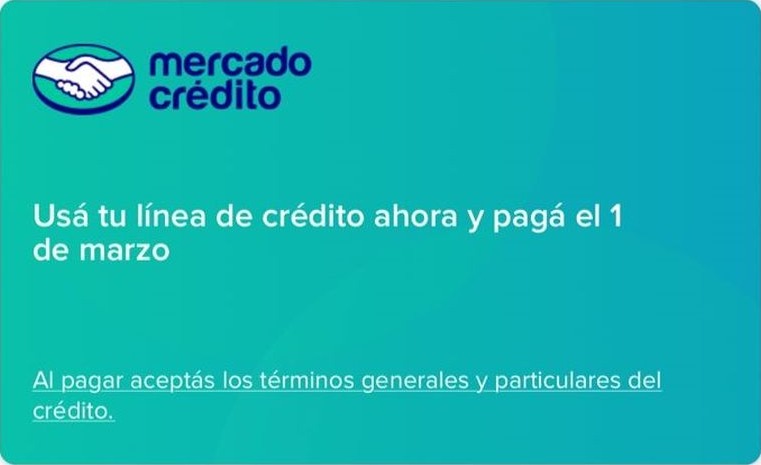
Account Money and Mercado Crédito looked too similar.
CX also received more contacts from users who didn’t realize they had used credit. Since the visual similarity between Account Money and Mercado Crédito was contributing to the confusion, we standardized the black Account Money card already used in Brazil across markets.
The user’s most-used card moved down.
Payment methods had previously been ordered based on each user’s usage, keeping their most-used card first. With two Mercado Pago options now fixed at the front, that card could move to third position, forcing users to swipe through the carousel to reach a payment method that had previously been immediately available.
One entry point for Account Money and Mercado Crédito
Account Money and Mercado Crédito were consolidated into a single entry point. Account Money remained the primary option, while choosing installments routed users to Mercado Crédito.
New credit acquisition decreased after the change, an expected trade-off as the previous hierarchy had led some users to use credit unintentionally. CX contacts related to this confusion also decreased, reinforcing the decision.
Before & after
From generic cards to recognizable payment methods.
The final carousel combined real bank artwork with a consistent Mercado Pago information layer across external cards and Mercado Pago’s own payment methods.
Outcome
A more consistent payment selection experience.
What started as a requirement to integrate real bank artwork expanded into a broader redesign of payment selection in checkout, improving how payment methods were identified, differentiated and prioritized.
The goal wasn’t to standardize the cards themselves. It was to create enough consistency around assets we couldn’t control to make the experience coherent as a whole.